
Project 1: Type in the Environment
GD1_Project1_2024In this project we will be looking at the visual vernacular of typography that surrounds us and is often overlooked.


DESCRIPTION
Graphic design, both creates and reflects cultural settings. This project is an examination and a critical reflection of the vernacular. Vernacular is defined as “the language or dialect spoken by everyday people in a particular country or region.” In this project we will be looking at the visual vernacular of typography that surrounds us and is often overlooked.
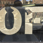
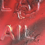
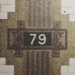
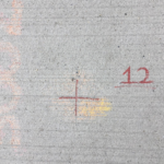
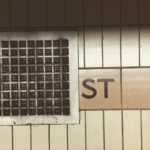
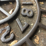
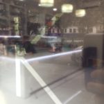
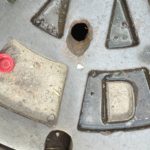
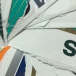
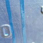
Find and photograph various examples of distinct typographic elements (no more than 2 letterforms per photo) in your environment. You will be asked to generate several images before your final images are chosen. The goal of this project is to create a tryptic of images (total of 3) that somehow relate (formally and/or conceptually) together, but come from different settings, perspectives or moments in time. Throughout this process, you will need to illustrate and explain to your audience (the class) the unique aspects that characterize the typography and the environment in which it lives in.
PROCESS
More is better–at the beginning stages of this project. Quantity leads to quality. Concentrate on showing a wide variety of different typefaces, weights, sizes, contexts, postures, and compositions. This is not meant to be purely an exercise of recording – you will also be critiqued on the compositional “quality” of the photographs, both technically & formally. Be concerned with scale, form and counterform, compositional and figure-ground relationships, activation of the edges, hierarchy, color and proportion (between the typographic element and the background).
Work towards what you consider “aesthetically” pleasing and exciting imagery, and be prepared to explain why. The images are not meant to be simply pictures of letters but of letters activating a space in the environment. Be conscious of the angle you are shooting from, the time of day and the type of day (sunny versus cloudy). It goes without saying, of course, that exposures should be correct and consider making use of a tripod for more professional results.
*Additionally, bring 2-3 examples of what you consider to be bad typography and good typography. Be mindful about what you choose to bring & come to class prepared to speak about your selection.
MATERIALS
+ Digital Camera or good cell phone camera
FINAL PRESENTATION
+ 4 x 6 color, 300 dpi resolution of 6 of your most successful images
+ Optically Center your images on an 8×10″ page
+ Create a print resolution pdf